Articles: Scroll Down For all Articles here in descending order
Sam Parker author . . . Thanks for permisson to use this article Sam !
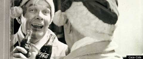
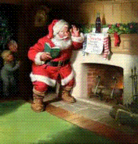
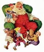
Haddon Sundblom first drew the Coca-Cola Santa we know today 80 years ago
Its a question many children wonder at this time of year: just how old is Santa Claus?
The answer of course depends on which version of him youre talking about. For most people today there is only one: the round-bellied, rosy-cheeked man in red who announces himself on our televisions every November with a convoy of Coca-Cola lorries and the hushed promise that Holidays are comin. That Santa, you can tell any inquisitive youngsters, is 80 years old this winter.
Haddon Sundblom was the artist commissioned by The Coca-Cola Company in 1931 to create a wholesome version of Father Christmas, and its his jolly image that any kid asked today to draw Santa Claus would approximate, giving rise to the popular theory that Coca-Cola invented Christmas.
In fact, it wasnt the first time theyd latched on to the legend of St. Nick to sell more soft drinks. Coca-Cola had been refining the idea since the 1920s when their first Santa ad featured a stern-faced man who more closely resembled Civil War cartoonist Thomas Nasts Union-supporting elf-Santa that first appear in Harpers Weekly in 1862.
But by the '30s, the penny had dropped - if Santa Claus looked like the very incarnation of happiness, then by association, a bottle of Coke would start to seem like the incarnation of happiness too.
Sundblom set to work, drawing inspiration from the real inventor of modern Christmas, poet Clement Clark Moore, whose 1822 poem A Visit From St. Nicholas - better known today as The Night Before Christmas - described Nick thus:
His
eyes how they twinkled! His dimples: how merry,
His cheeks were like roses, his nose like a cherry;
His droll little mouth was drawn up like a bow,
And the beard of his chin was as white as the snow
Soon, arguably the most famous advertising icon in history was born as Michigan-born Sundblom spent the next 35 years painting the Father Christmas Coca-Cola still uses to this day. While earlier artists were first to give Santa a face, or even paint him as cheery, Sundblom was the first to give the world a consistent version of the man in the sleigh.
As Joanna Berry, Lecturer in Marketing at Newcastle University Business School, explains: "Whilst Sundblom didnt invent Santa as the jolly, white haired rotund old man we all now expect, he certainly did more than anyone to imprint that image onto our minds in relation to Coca-Cola in one of the most enduring brand images ever to have been created."
Despite this wholesome association, Sundblom had his racier side. He regularly took breaks from Santa Claus to paint pin-ups and glamour pieces for calendars, including his final assignment, a painting for the cover of Playboys 1972 Christmas issue. But to label him a one-character painter or simply a purveyor of saucy caricatures would, according to Berry, be doing him a disservice.
"Roger T. Reed wrote that 'More than any artist including Norman Rockwell, Sundblom defined the American Dream in pictures, proved by his work for virtually the entire Fortune 500'. I think its important to remember that Sunny was about a lot more than Santa.
"His ensuring legacy includes not only his body of work but also the many artists who went through his studio and came out influenced by his very clear style including Howard Terpning, Gil Elvgren, Earl Blossom and Morgan Kane."
Nevertheless for most of us, Sundblom will always be remembered for the modern day St Nick.
GRACE G. DRAYTON
by Denis C. Jackson
Grace Gebbie Drayton was born in Philadelphia, Pennsylvania on Oct. 14, 1877, to George and Mary Fitzgerald Gebbie. In her early years she attended private schools in Pennsylvania. Grace was drawing little children by the time she was five years old. Her father also encouraged her artistic ability. Her sister, known professionally as Margaret G. Hayes, also illustrated stories, drew postcards, paperdolls, and wrote many of the verses accompanying Grace's drawings. If one compares the sisters illustrations of cuddly children one see many similarities.
Grace Drayton is now best known and remembered as the originator and illustrator of the famous Campbell kids. Graces kids graced the labels of Campbells soup cans for many, many years after her death and the images are an integral part of our American youth culture. She did over 300 drawings just for Campbell soup and did many others for the rest of the product line over the years. Grace also created The Dolly Dingle line of paperdolls for magazines. Plus, postcards, cartoon strips, dishes, banks, doorstops, stuffed animals, story books, lamps, and dolls. From the years 1912 through about 1933 Grace drew over two hundred paperdoll pages for Pictorial Review alone. Many of these were the "Dollie Dingle" series of paperdoll cut-out pages. These still hold very fond memories for elderly women with little girl hearts as the reproductions of these today make a new generation of little ones happy. It is surprising that any of these CUT-OUTS from the old magazines have even survived at all. One of the paperdoll verses of the day said it all, "Run, get your scissors now an' see, What cozy plays you'll have with me. Good-by -- till next month -- Dolly D." Also in that period she produced seven years of weekly or daily cartoon strips, some of the comic page series were; 'Turrible Tales of Kaptain Kiddo', 'Dolly Dimples and Baby Bounce'and one 'Pussycat Princess', the later strip ran many years and was eventually taken over by another artist. She illustrated and authored many books as well. Many of her following old books are difficult to find. 1905 "Mother Goose Rhymes", 1906 "Golden Hours With Mother Goose", 1909 "Bobby Blake", 1909 "Dolly Drake", 1910 "Fido", 1910 "Kiddy Land", 1910 "Kitty-Puss", 1911 "Kiddie Rhymes", 1911 "Kaptin Kiddo & Puppo", 1911 "Vegetable Verselets", 1913 "The Peek A Boo Book", 1914 "Teddy Kins", 1914 "The Baby Bears", 1915 "Baby's Day", 1915 G.G. Drayton's "Jumble Book", 1918 "Little Chum's Book", 1931 "Dolly Dimples and Baby Bounce". Also a number of books were done under her married name of Grace G. Weidersiem; All 1914, "Babykins Bedtime Book", "Happyland Book", "Little Pets Book" and "Rosy Childhood". Other titles in these years. The bulk of her illustration work for books was done from 1909 to 1915. She still found time in this period to design at least twelve dolls, write a Bear Cub Series, illustrate fashions, calendars and displayed her art on the magazine covers of McClure's, Leslie's, Judge, Saturday Evening Post, Ladies' Home Journal, Woman's Home Magazine and Pictorial Review.
Her first marriage was to a Mr. Weiderseim and it ended in divorce and on June 23, 1911, she became
Mrs. W. Heyward Drayton III of New York City. She retained her original name for her art and from that period forward signed her drawings Grace G. Drayton.
She was a member of the Fellowship of the Academy of Fine Arts in Philadelphia, the Author's League of America, the Society of Illustrators, and the Art Center.
She died of a heart attack in New York at the age of 58. The date was January 31, 1936.
-=END=-
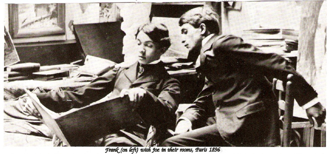
FRANK XAVIER LEYENDECKER
By Mona Nevins
FRANK XAVIER LEYENDECKER - painter and illustrator. Born in Germany in 1877. He came to America with his family in 1883. He studied at Chicago Art Institute and in Paris at Julien Academy, pupil of Laurens and Constant. He was also a designer and painter of stained glass windows. He died at a early age of his career.
The parents of Joseph Christian and Frank Xavier were Peter Leyendecker and Elizabeth Ortseifen. They were married May 1869 at Wirzenborn. The Leyendeckers were of Dutch ancestry, coming to America in 1882 from Germany. There is a daughter and Frank at thirteen years of age had foregone education beyond the elementary level to apprentice to Carl Brandt from Vanderpoel, Vienna.
Frank Leyendecker enrolled in the 'life class' the evening class at the same time that his brother was taking both day and evening courses in 'costumed and nude life, composition'.
Frank was eighteen when he went to Paris with his brother Joseph, not only to study but also to provide companionship. Their first sight of Paris in 1896 which they had so long saved for and so eagerly awaited study there must have been overwhelming with architectural splendor, gaiety and sophistication of the city. A Charcoal study of Frank was the catalog cover of Joseph Leyendecker's one-man exhibition at the Salon Champs du Mars in April 1897. They spent a total of two years at the Academie Julien in Paris.
Both brothers sailed for America in August 1897 and in September they opened a studio in Chicago's Stock Exchange Building. Frank was then twenty years old. He did not have the same determination to reach the top. After accepting commissions, he would often delay, - sometimes the jobs would be offered to other artists.
In 1899 the two brothers decided to move from Chicago to New York City and there established a studio at 7 East 32nd Street. Then in 1914 they built a 14 room mansion on Mt. Tom Road in New Rochelle. As a young man Norman Rockwell idolized these two great talents, especially Joseph, and took every opportunity to catch a glimpse of him.
We should be able to understand the difficulties Frank experienced throughout his life - he was the "other Leyendecker." In the early twenties, tensions at the mansion began to mount and Frank moved into an apartment - studio in New Rochelle. But in 1924 on Good Friday (in April) Frank died at the age of 47.
Frank X. Leyendecker left an art legacy that few will contradict as proven by these outstanding examples of his art and illustration. He did covers and advertising for Saturday Evening Post, Vanity Fair, Vogue, Collier's, Life and other periodicals, as well as book illustrations.
His brother Joseph lived until 1951. Norman Rockwell in his book tells about the funeral J.C. Leyndecker and how it saddened him. He had looked up to Joseph since he was a teenager. He tells how the two brothers resembled the Arrow man, so nattily dressed, stepping smartly down the street with black & white shoes, in fashion then, and white trousers, navy blue jackets with shiny brass buttons. Rockwell was greatly influenced by Leyendecker's covers and he was the only artist to paint more for Saturday Evening Posts.
With the on going resurgence of interest in illustrators today those of the Leyendecker period were giants in the area of artistic talent. His and other original works are bringing five figures and more at auction and those who cannot afford an original are happy with each new find of a cover, advertisement or booklet illustrated by the Leyendecker brothers, or even a tiny tail piece from a magazine that bears the mark of the man.
-=END=-
The publication of the book "Poems of Childhood " by Eugene Field, with illustrations by Maxfield Parrish, stirs anew the enthusiasm that this artist's work almost invariably arouses. Mr. Parrish is one of those rare illustrators who never disappoint. There is always something to admire in his work, and in most of his pictures a cause for genuine delight. The position of Mr. Parrish in the field of modern illustration is unique. His work is strongly individual, and possesses qualities so original that imitation brings instant betrayal with it. His pictures and decorations have a distinct place of their own in modern American art, and they have won for him a special kind of admiration, differentiating him in the public mind from his contemporaries. His public is a wide one, including the students of art, who finds satisfaction in his supremely clever technique; the thoughtful man, who is impressed by the highly imaginative poetry regaled in his work; and the average person of taste, who is charmed by the richness of his color compositions. His work, while enjoying popularity, at the same time wins the most exacting critic. A curious thing about Mr. Parrish is that he seems never to have had a term of apprenticeship, but appears to have arrived full-fledged and finished in his art. His earliest work reveals the qualities that have won distinction for him, and nothing that has appeared from his pen or brush shows a touch of immaturity. One is impressed almost at the first glance by the exceeding care shown by Mr. Parrish in his drawing. He is conscientious to a degree that permits no work to go from his studio unfinished. In the early days, when asked to submit a sketch for consideration, he said: " I will show you a completed design; it is easier for me to do that than to make a sketch." When we recall that "the early days" means only about six years ago, we realize how rapid the progress of Mr.Parrish has been.
He is now scarcely more than thirty years of age. He comes of old Quaker extraction and has a heritage in art! For his father, Mr. Stephen Parrish, is a painter and etcher of ability. Mr. Parrish graduated at Haverford College and then entered the Pennsylvania Academy of Fine Arts, after which he studied for a time in the class of Mr. Howard Pyle at the Drexel Institute. The first designs that brought his name to public attention were two posters, each of which won prizes in a competition in 1897. One of these posters was made for the Pope Manufacturing Company, the other for the August number of the " Century Magazine." These designs led to the making of magazine covers, and in this field Mr. Parrish won a place of distinction at once. During several succeeding years there appeared on the covers of some of the leading magazines a number of exquisite, poetic designs that made Mr. Parrish's name widely and favorably known. His fine decorative effects in deep purple forest or sunny blue sky, in delicately modeled figures or formal classic architecture, were something new in the art of cover designing, and they became standards of beauty of their kind.
Mr. Parrish has from the beginning revealed a special talent for decoration, and though he has become celebrated as an illustrator, his first productions were of a decorative character. Notable among these was the mural decoration of "Old King Cole " on the walls of the grill-room at the Mask and Wig Club of Philadelphia, a design which has since been reproduced and widely enjoyed, not only for its drawing but for its delicious humor. There is humor in much of Mr. Parrish's work, and of the finest kind. The humorist in him, however, is balanced by the poet, and frequently the two are exquisitely combined. The poetic vein in his nature is exalted and spiritual, the humor quaint and whimsical. Both find ample expression in the illustrated edition of Eugene Field's " Poems of Childhood" just published. In these charming verses--not inaptly characterized as " chapters from the gospel of childhood " --Mr. Parrish's talents have found the best possible scope. There is in his illustrations the same ingenuous, childlike frankness, the same whimsical humor and delicate pathos that we find in the text. The spirit of the illustrator not only pervades the verses but envelops them as well, extending even to the cover. In fact, the cover design is one of the best things about the book. The slender, graceful boy and the huge giant, gazing in mutual wonder and amazement is a characteristic example of Mr. Parrish's humor, and one of his most pleasing color compositions. Mr. Parrish is at his best in color. His palette is rich and full; his use of color strikingly effective, both as a means of artistic and of poetic expression. The picture of " The Sugar-Plum Tree " is full of the splendidly somber shadows wherein the child-imagination expands; the pale mists that envelop Wynken, Blynken, and Nod are steeped with the mystic charm of childhood's dreams, partly veiling, partly revealing, the wonderful sights and the beautiful things on the " river of crystal light." The picture of " Little John and his Sister Sue," while irresistible in its humorous aspect to older folk, is both in spirit and in composition a monument of child pathos. The figures of tousle-headed and knickerbockered John, and Sue with cap and checkered gingham, are most actual and realistic. Pedestaled on high, and silhouetted against an ideal landscape and glowing sky, they present a contrast that plays havoc with one's emotions. " Seein' Things at Night" is a composition, we venture to say, that no child can look upon with composure. The foreground of the picture, where the blue-and-white counterpane of the bed falls toward The floor, shows Mr. Parrish in his most careful mood, working out with amazing technique the folds and squared pattern of the fabric. The shadows beyond the bed are filled with monstrous " things standin" in a row, and lookin' at me cross-eyed and pointin' at me so." In this field Mr. Parrish's imagination passes even beyond the text, and conjures up a group of night ogres before whom even the boldest of us must shiver.
Perhaps the most beautiful and poetic of all the compositions in the book is the picture that accompanies the poem of " The Dinkey-Bird," showing the figure of the child swinging in space from the limb of the Amfalula-tree, in the land of Wonder-Wander, by the " ocean 'way out yonder." It seems to us that Mr. Parrish has made no illustration more exquisitely charming than this, in color, in composition, and in poetic feeling. With the picture before us we read the poem again and find new meanings in it. It is more than an illustration; it is an illuminating interpretation. One can linger long over these pictures and come back to them eagerly after laying them down.
It is not only in the things that he has done that Mr. Parrish is interesting; it is in some of the things that he has not done. His imagination finds expression not only in warm, rich tones and a glow of color, but, when other ends are sought, it employs the most subdued effects, and at times it rests on empty spaces. He knows as few artists do the full value of white paper, and the fine finish of his work and his cleverness in detail is equaled by his taste and good judgment in the matter of what should be left undone. Referring once to a very eloquent bit of white paper in one of his drawings, he said, in his quaint manner, " That is one of the best things I didn't do."The illustration of the Flyaway Horse in the Field book presents an example of the curious contrasts to be found in some of Mr. Parrish's compositions. There we find white paper, a simple, decorative flat background, and two of his grotesquely comical figures standing on an elaborately tiled floor, the figures and the flooring worked out with the fullest detail, in contrast with the simple background. Mastery of small detail is characteristic of Mr. Parrish. We continually wonder at his patience and painstaking care. And yet, with all his elaboration of detail, there is in his work a classic simplicity- and a largeness of idea that place his pictures among the enduring things of art. Each new work of his is in a way a new revelation, and it would be hard to fix the limit of his powers.
(editor's note) This article was written just after the turn of the Century for a popular magazine of the time and is from the archives of The Illustrator Collector's News.
End
Check out our 12th Edition, Year 2,013 Parrish Price Guide.... Found on the main page
STARTS WITH A GROWL, ENDS WITH A PURR
By EARL MORAN: The Pin-up artist
It all began with a small kerosene lamp in the town of Clinton, Iowa. My first recollection of doing any drawing was at the age of five or six. Getting out of bed at four in the morning, I'd light my small kerosene lamp and start working.
My favorite subjects in those days were wild animals, especially lions. I still get a kick out of watching the big cats on television whenever African hunting scenes are shown. I guess I must always have had a secret desire to own one as a pet, but such yearnings have had to be satisfied with less ferocious creatures and I've had four Chow Chows at different periods of my life.
During my school years in Clinton, and until I finished high school, I made many cartoons, mostly of my teachers and of humorous incidents that happened at school. These were usually passed around the classes without the teachers ever seeing one. If they ever had, chances are I would have been expelled.
Around that time, my artist heroes were Charles Dana Gibson, James Montgomery Flagg, and Coles Phillips, whose stocking ads and magazine covers were the sensation of the day. After graduating from high school, and knowing how little the idea of work appealed to me, I considered a career in art. Drawing didn't seem to be anything but fun and I just naturally took a train to Chicago and enrolled in the Art Institute.
Art work was tougher than I expected, but also a lot more interesting. I had to work in the school library for my tuition, in cafeterias for my meals, and sometimes in theater checkrooms for extra cash. But I kept a sketch pencil and pad going all the time and was enjoying every minute of my life.
After two years of basic training at the Art Institute, I enrolled in the Art Students' League of New York and studied with such masters as Vincent Dumond, Robert Henri, Thomas Fogarty, and the famed anatomist, Bridgman.
I'm afraid I didn't learn too much, possibly because I was not in the best of health. A medical check-up showed symptoms of lung trouble and I had to give up my art studies and go to a milder climate. The doctors told me I could never work indoors again, so I moved west to Los Angeles and took odd jobs driving a truck, moving furniture and delivering packages for a department store, The Broadway Downtown.
At the end of a year and a half and with some added twenty pounds, I was again on the train bound for Chicago. I arrived with $11 and by lunchtime of the same day had found a job at $15 a week with an engraving company. Inside a couple of years I was doing men's fashions with the Vogue-Wright Studios for Sears, Roebuck and Montgomery Ward catalogues. I managed to save some money and moved on to New York and went to work for another art studio.
I really was fed up with the routine of this kind of work and wanted to try something on my own, so after a year and a half, I returned to Chicago determined to try free-lancing. I painted two pastels of bathing girls, 30"x40" and shipped one to an Iowa calendar company and the other to Brown & Bigelow in St. Paul, Minnesota. I was astonished when both sent back goodsized checks and requested more of my work as soon as possible.
Brown & Bigelow wired me to come to St. Paul as their guest and while there, to make another painting for them. I guess they just couldn't believe I could do another one as well. I showed them I could and by the end of the week I had signed a contract to work exclusively for them in St. Paul.
It was the beginning of about a quarter of a century of exclusive calendar girls and as far as I'm concerned there's been no more enjoyable work in my life. I started the job with an enthusiasm that has never dwindled and by the end of three years, I was in my own studio in New York with a substantial increase in salary plus all studio and model expenses paid by Brown & Bigelow. My penthouse studio atop the McCutcheon Building on Fifth Avenue at 49th Street became known to cafe society celebrities and to all the popular artists in the New York area.
During my first few months there, life moved fast. I was invited to judge my first bathing beauty contest at Coney Island to pick Miss Empire State. John Powers of the famed model agency, and Irving Hoffman, the publicist, drove me out to George C. Tilyou's Steeplechase Park. Milton Berle was there, not as a judge but to try out his jokes on the judges. It was a real thrill to see myself on the Pathe newsreel later, measuring the top dimensions of the winner, who later posed for many of my calendar pictures.
Other contests followed in Albany, Staten Island, and in New York City itself. Life Magazine phoned one day and invited me in for a chat, which resulted in a color display of my art. There have been three issues of Life in which my work has been featured.
My name and samples of my art appeared frequently in magazines and newspapers during the Forties, and gossip columnists in particular seemed to enjoy doing tidbits about me. I never quite understood all this attention. I was just interested in painting girls for calendars, that was all. Yet mail arrived in bundles from all over the world, from the armed forces on land and sea, from service clubs, universities, and always from young ladies who were convinced they were just my type and wanted to come to New York and model for me.
I tried to discourage them but the more determined ones came anyway. I recall that the post office was always most obliging about delivering mail with no other address than New York; City.
I've never felt that I'm an artist in the true sense of the word. All I've had is a special talent with color and form and light and people seem to enjoy what I paint. I live the life of an artist and I've lived it. It's that everyone may not be able to be a millionaire, but it's fun to live like one! Like Picasso once said, "When I'm alone, I do not have the effrontery to consider myself an artist at all, not in the grand old meaning of the word. Giotto, Titian, Rembrandt, Goya, were great painters. I am only a public clown--a mountebank."
So now you can understand why I have so very little to say about any of the work; I've produced.
Visitors have made their way to my studio from all over the world--the House of Parliament, remote monasteries, "just to see the man who paints those lovely girls. I've received a weird assortment of gifts, from small museum elephants to exercise machines. I've managed to take it all in my stride.
My studio had taken on the aspect of the cross-roads of the world and I was enjoying it to the hilt. The pleasantest of my memories are the friendships of the some of the loveliest girls in the world, who posed for me.
I recall the time Joan Caulfield sat, when she was just preparing to open in her first Broadway show. She confessed that in spite of the great honor of a Broadway starring, part, she was really a bit scared she wouldn't make it and so she wasn't ready to quit modeling --not yet.
Another rather frightened little blonde lunched one day with Adrian Lopez, the New York magazine editor, and myself. Her name was Barbara Nichols, and apparently her initial fright hasn't stopped her from achieving top starring parts today in films and television.
Speaking of Adrian Lopez reminds me that I went into the publishing business for a few years in New York with Bob Harrison. We put out a magazine called Beauty Parade which was a success right from the start. I got out of the business because the pressures were too much, and took away time from my painting Harrison went on to publish a string, of magazines with great success.
About that time, the newspapers and magazines were devoting a lot of space to variously distorted images of my private life, to such a degree that I began to worry that models would avoid my studio to protect their reputations. Oddly enough, it worked out just the other way, The publicity brought a renewed siege of visitors and applicants knocking on my door and I was somewhat relieved when Brown & Bigelow asked me to go to St. Paul for a few months to make a portfolio of sketches for future calendars. I did not know it then, but I was closing my New York studio for good.
When I finished the sketches in St. Paul, B & B's president, Charles Ward, asked me why I wanted to go back to New York. I could work anywhere in the world, he pointed out, and ship my paintings to St. Paul.
It seemed like a good idea and I did want to visit my children in Los Angeles. So I rented the studio of Henry Clive, whose covers for the Hearst Sunday Magazine are famous' and I settled down in California and immediately met up with a whole new set of wonderful people.
Ken Murray dropped in with Marie Wilson one day and I painted her fabulous form for calendars. Since Ken's "Blackouts" were having a successful run in Hollywood, I became a frequent backstage visitor. One day a blonde kid named Norma Jean Dougherty came by looking for work. For the next four or five years, she posed for many of my paintings and during that time changed her name to Marilyn Monroe. Ken Murray was taking his show to New York and he told me Marie Wilson wasn't going. Did I know anyone who could replace her?
I told Marilyn to see Ken about the job and as she always followed the leads I gave her, she did. Ken very wisely told Marilyn her future was in Hollywood and his prophetic words turned out to be true. though Marilyn had a most difficult time before she made it.
I recall a time when she came to pose for me and her shoes were absolutely run down and beyond repair. I gave her a pair a previous model had left in the studio and Marilyn wore them home. Later she gave me the form-fitting dress she wore in "The Asphalt Jungle," which was one of the films that catapulted her to fame.
As I had one of the first TV sets in Los Angeles, the studio became more popular and crowded than ever. The fact that I was using the best of Earl Carroll's Vanities girls for models, didn't do much to slow down the traffic, either. I made one of the first TV shorts with Earl s Vanities girls, showing me making a painting of one of them. The music helped.
A couple of years later I bought a new home in Brentwood with a built-in studio. I hardly got settled in that when I found myself living in Las Vegas seven months later.. Two years of those bright lights day and night made me hunger for the country life and I moved back to a place in the San Fernando Valley. It had a pool with the studio built at the end of it and I felt I had found a permanent place at last.
One of my first models there was a fresh arrival from Texas and some things about her reminded me of Marilyn Monroe. Her name was Mansfield, first name Jayne. She had a warm personality and I did a number of paintings before she went to the New York stage.
She happened to mention my name to a Broadway columnist. The result is best expressed in a letter she wrote to me: "I imagine you know that Monday night I'll be popping out of your picture on the Steve Allen show. The idea sounds so cute. Little did we know what the outcome of those pictures would be. I'll be thinking a special hello to you and Gloria on Monday and I'll say something if I can." For some reason which I don't recall, I missed that particular program.
Another Moran model now on Broadway and launched on a singing career is Joi Lansing who appeared in "The Living Room" and is now a top movie and TV actress. My painting of Joi is in my personal collection of beautiful girls.
Due to the friendship and influence of two of Hollywood's top photographers, Max Munn Autrey and John Meredith, I've taken a fling at photography lately and find my photographs in demand in New York, Philadelphia, Cincinnati. I've also turned to more dignified portrait painting of men and women and consider this my best work.
Of necessity and modesty, and because this biography has space limitations, much of my private life has been excluded. But I do know many readers will be interested to know I'm married, my wife is an artist too, and of my four children, television viewers are seeing a lot of daughter Peggy, in re-runs of her movies.
Well, that sums up a career that started with a small kerosene lamp and, believe it or not. that same lamp sits right here on the coffee table before me.
(The article was originally written in the late 1940s)
Check out our Price & ID Guide on the American Pinup Artists on the main page
THE END
Prints, Calendars and the Care of Our Old Paper Collectibles
By John Molumby
A Golden rule in old paper is that when storing, or framing old
paper, and especially when re-framing always use all-rag mats,
acid-free papers and backing boards, the quality of these
materials today are vastly superior to most of those used in the
distant past. Even though you may destroy the backing paper of a
quality framed print from the teens or 1920s when replacing
backing materials and cleaning. If you do not do this then within
a few years your investment will quickly degrade if it isn't
doing so already.
What causes the most damage to old paper? It is often handling. The rules of handling are as follows:
1. Use clean hands when handling old books and old paper items.
2. When lifting matted or unmatted materials, use both hands to keep them from bending, creasing, or tearing.
3. Unmatted prints & calendars should never be stacked directly on top of each other but should be separated by a smooth, nonacid cover tissue or paper, also in a pinch you can use quality plastic bags.
4. For optimum protection valuable pictures should be matted rather than left loose. Less valuable prints or paper can be kept in acid-free folders, albums or envelopes.
5. Never use pressure-sensitive tapes "Scotch tape, masking tape, etc.", gummed brown wrapping tape, rubber cement, synthetic glues.
6. Prints glued down on old boards should be handled with as much care as any unmounted, brittle, easily torn prints are caused by age are most common, the mounted backing gives a false sense of strength.
7. When transporting old paper items, mailing, or shipping loose pictures, place them flat between stout boards or unbending cardboard, package tight, do not roll most old paper.
Humidity is a chief culprit and danger, excessive humidity causes the growth of mold. Since mold cannot grow unless the humidity exceeds seventy percent, preventive measures must include keeping the humidity below that amount. Air conditioning or dehumidifying machines are the answer in moist climates and damp buildings. For Boxes, cases and small storage areas silica gel in crystal form is good,it is a dehumidifying agent. When hanging or storing prints be aware of dampness on outside walls in stone houses and in basements and cellars. Houses closed up for an extended length of time may become excessively humid and should be aired periodically and checked for signs of dampness or musty odors.
Mold growth in paper often shows up as dull rusty patches that discolor the sheet. This is called "foxing" and may be caused by the chemical action of mold and/or the metallic salts often present in paper and inks. It grows easily on pastels, which contain good nutrients for mold in their binding media. Also they are a common on many older prints that have been exposed to excessive moisture. Foxing is the usual result of prolonged, high atmospheric humidity, but if water itself seeps into the picture or book, rampant proliferation of mold may completely envelop the object. First-aid treatment is to remove the object to a dry environment. Open the frame or spread out the pages so that air can circulate freely to the infested areas. Expose to direct sunlight for about one hour to kill the mold or, preferably, place in a closed container with some crystals of thymol, a fungicide, for two or three days.
Small sachets or dishes of thymol crystals placed in
bookcases or storage containers can help to prevent mold. Book
and art collectors may also want to construct a thymol cabinet
designed specifically for treating mold. It should have a metal
floor on which the thymol crystals are placed and several racks
or shelves on which prints and books can be spread out to allow
the thymol fumes to permeate the paper. The metal floor is gently
warmed from below by low-wattage (forty-watt bulbs, which are
turned on every day or two for about an hour to make the thymol
crystals volatilize more effectively. The placement and power of
the bulbs should be adjusted so that the metal floor never feels
hot. If evaporation occurs too quickly, the thymol vapors may
saturate the air in the cabinet, recondense as small oily
droplets, and form spots on the pictures. Since thymol softens
oil paint, the inside of the cabinet should be left unpainted.
For the same reason pictures painted in oils should never be
treated with thymol. Thymol is volatile, it offers no permanent
protection against recurrence of mold if an object is returned to
a humid environment. The rules for guarding against mold are as
follows:
1. Keep the humidity below seventy percent; about fifty percent
is ideal. Do not store paper, prints or books in damp cellars or
basements.
2. Avoid hanging pictures on the outside walls of a house, especially if they feel cold or damp.
3. Never frame pictures directly against the glass. To do so invites damage by mold growth or condensation of moisture.
4. Clean bookshelves, frames, and storage areas regularly, as dust contains a large amount of airborne mold spores.
5. Good circulation of air reduces chances of mold growth. Circulation of air behind a frame is improved by attaching small pieces of cork or wood to the lower two corners to keep the frame away from the wall.
6. Never store old paper or books directly on the floor. Raise them on supports to allow circulation of air.
7. Avoid leaving books and prints in a closed room or house for extended periods of time without providing some means of circulation or dehumidification.
8. Fumigate infested books, prints, paper ~except oil paintings~; with thymol (found through most chemical supply houses) fumes to kill mold, and be sure to correct the conditions that originally caused the mold growth.
Light: of all the external forces that can affect paper, is perhaps misunderstood because it is so much a part of our everyday experience - is often the most ignored. The print or illustration of today serves as a decoration on the walls of a house, office, or gallery. The long term result is a drastic increase in such during the last several decades and in the damage resulting from overexposure to light.
Collectors, rightly concerned with this hazard, often ask conservators whether fading can be stopped by keeping prints and collectibles paper, watercolors, drawings, or colored book bindings in subdued light. Unfortunately, and to their surprise, the answer is "no." It must be remembered that all light fades works of art on paper; less light means only less fading. Pigments used by the papermaker to tint his product or by the artist to create his image do not automatically stop fading when the light drops below a certain level. And fading is not reversible. Placing a work of art on paper in darkness merely halts the process and does nothing to promote recovery or rejuvenation.
How much light should be used for viewing works of art on paper? What minimum amount of light does the human eye need to perceive all colors in their proper relationships? The answer is one of degree. Anyone who takes a walk by moonlight can verify that when light is at an extremely low level the eye loses all ability to perceive colors and can only distinguish tonal, or black and white, values. Therefore, one can only conclude that there must be sufficient light for good viewing, but any excess, which will hasten fading, must be avoided at all costs. An optimum amount of light is five footcandles, which corresponds roughly to the output of one Iso-watt reading lamp at a distance of three or four feet. In other words, use the same amount of light for viewing works of art on paper as is required for casual reading.
Bear in mind that the human eye is a poor judge of light quantity because it adapts so easily to major changes in intensity. The eye needs mechanical assistance to make an objective determination of light quantity. This can be accomplished with some of the older photographic light meters, such as the Weston, which are calibrated in footcandles. Follow this procedure. Take a sheet of white blotting paper or other similar unglazed white paper, at least one square foot in size. Put the paper in the position that the picture is to occupy and, following the manufacturer's directions for using the meter, make a reading of the light reflected from the sheet of paper. The proper amount of light is now determined.
The next step is to guard against unnecessary exposure. Museums and historical societies control exposure by various means. It is their practice, for example, to keep delicate watercolors and documents with fading ink in storage for viewing only by appointment. They display them in rooms lit artificially only during well-defined hours. They install them in cases protected with fabric coverings, which the visitor himself can remove and replace. In the nineteenth century, some Victorian frames for watercolors were equipped with a small curtain, resembling a window shade, that would roll up inside the molding when raised to view the picture.
Most large museums rotate selections from their holdings so that an object is never left on view for more than a few months at a time, a practice which even the modest collector might well emulate. Simply changing the position of the pictures in your house once every year or so will not only diminish the possibility of their fading but will also place them in a new perspective that will enhance enjoyment of them. The established collector might even consider the possibility of storing a certain percentage of his collection on a rotating basis.
Avoid hanging pictures or placing bookshelves or glass-fronted bookcases on a wall directly opposite windows, since the light is likely to be greater there than anywhere else in the room. Translucent curtains or louvered blinds can used to moderate or redirect the bright light of day.
Pictures should, of course, never be hung in direct sunlight. Even reflected
or indirect morning light reflected from within a room will cause negative effects. Indirect daylight, however, carries a danger in addition to intensity, for it is a source of ultraviolet light, which, though invisible, is even more destructive than visible light. Ultraviolet rays accelerate fading and even cause deterioration of the paper itself. Watercolors, prints, drawings, paper and books should therefore never be exposed directly to these damaging rays. Fluorescent lights are a potent source of ultraviolet light and should always be covered with cylindrical plastic sleeves that filter out the dangerous radiation. Alternatively, ultraviolet-filtering acrylic plastic may be substituted for glass in a picture frame.
Heat; do not expose paper and books to heat, since high temperatures accelerate the deterioration of paper. Do not hang prints over a radiator, heating register or air duct. The enticing spot above the fireplace is doubly bad as a place to hang prints, first, because of heat, and, second, because soot and gummy residues produced by the fire adhere to the glass and obscure the picture.
Air Pollution Urban areas are antipaper. The city dweller should realize that a polluted atmosphere is one of the dangers that threaten the longevity of paper and the permanence of works of art on paper. The most harmful contaminant in the atmosphere is sulphur dioxide, a gas produced by combustion of fossil fuels like coal and oil; it is a major constituent of smog. Sulphur dioxide attacks paper and causes discoloration, brittlization, and eventual disintegration of the paper fibers. It is absorbed by the paper and converted into sulphuric acid, a particularly strong acid that does not evaporate and leave the paper even after it has been removed from contact with the gas. Severe brown stains caused by this destructive pollutant are often seen on framed pictures that have been partly or entirely exposed to the air by lack of proper backing. Sulphur dioxide also robs leather bookbindings of their strength and pliability and can eventually reduce them to mere powder. At the turn of the last century library holdings were severely damaged by the high concentration of sulphur dioxide produced by the use of illuminating gas.
Air pollution seems to be an inescapable hazard of urban life. The only sure defense, short of removing the paper to the relatively uncontaminated air of the suburbs or the country, is to install air conditioning. The restorer can help to minimize the effects of pollution by washing or deacidifying paper that has been exposed too long to city pollutants. Protection of framed prints with all-rag board, front and back, plus a backing large enough to cover the entire mat will help to minimize danger from a polluted atmosphere. GOOD LUCK!
END
Has Your
Face a Better Side?
The Views of Harrison
Fisher by Alexandra Grey
We are none of us absolutely symmetrical. The left half of one's body is not exactly like the right half. One foot is slightly larger than the other; or the ears are a little different. Particularly, the two sides of the face are not exactly alike.
Most persons who during those moments when they are compelled to look at themselves in the mirror discover that their faces are perceptibly lopsided experience only a fleeting wonder and let it go at that. Even among most women it is not a thing to worry about. But girls who are beauties by profession--models, actresses, movie aspirants, whose faces are their fortunes--know which side of the face is comelier, and they act accordingly.
Harrison Fisher, famous artist, is my authority. A countless procession of models has posed for him. In almost every instance, when he has suggested a certain pose to one of his models, she will say: "Oh, no! Don't draw that side. This side is much better." Much self-examination has taught her at what angle she looks her very prettiest. The reason models have learned so much is this:"'they have been sketched and photographed hundreds of times. They learn from the pictures of themselves.Most of us, photographed perhaps only once in a few years, are always disagreeably surprised at the variability of our looks. A photograph reveals and exaggerates defects in a way that a mirror does not, for most persons when they look into a mirror unconsciously set their features into an expression they have long before decided they liked best. But a photograph not only catches us as we are much of the time but it brings out strongly all defects and lack of symmetry. If the nose is deflected slightly to one side (and almost all noses are), a photograph which emphasizes one cheek will make the nose look long and strange; if it shows the other cheek, the nose will look flatteringly short and straight.
In fact, it is said that if one had two photographs taken of the right side of the face, and then had one of them reversed, the resulting ensemble would not be perfect--there would be a difference.
Models who have been photographed and sketched hundreds of times know all this.
" Some of my models," Mr. Fisher said, " confide to me that when they go to a restaurant to dine with a man they always arrange that their escort sits at such and such a table and in such and such a chair, so that all during the evening he will be gazing upon the girl from a point of view which is the most complimentary to her prettiness.
" These girls know that one eyebrow is different from the other (and, of course, they like the prettier eyebrow better). Or the ear on one side is better. Or the teeth are not so straight and even on one side as on the other." Of course, I think that these irregularities are often the very things that enhance a girl's looks and make her beautiful. Eyebrows that are different--one higher than the other--can be charming. Even defects are sometimes fascinating. I have seen girls who have had a slight cast in one eye, or who have eyes of a little different color, or who are ever so slightly walleyed, who are more magnetic and attractive because of these things.
" The kind of girl I have admired and drawn a great deal (so much so that it is the kind of girl that is demanded of me, and so I will probably continue to draw her for the rest of my life) is a girl with a straight, short nose, blunt but well-shaped. I think of it as a blonde's nose frank, childish, honest. Among the girls who pose for me, this seems to be the kind of a nose they admire most. Usually if they haven't one, they wish they did."Almost every girl, says Mr. Fisher, unless the bony structure of her face is malformed, has the possibility of good looks.
" Look at the women opposite you in the street car," he said. " Go all down the line. In almost each instance you can see that had the woman a passionate interest in being goodlooking and had she taste--an idea of what good looks are and what to do about it--she might be quite a beauty. Plenty of women with very handsome features are reduced to insignificance by a muddy complexion, or dull eyes, or a poor hair arrangement.
" On the other hand, many girls mar their looks in order to be fashionable. Plucked eyebrows, for instance. On certain faces a hairline eyebrow, delicately arched, is all right. It is all right in faces with smooth, molded contours, like those of a Dresden china shepherdess or a Marie Antoinette. But I think that usually eyebrows in all their original breadth and thickness and roughness and irregularity are much more charming.
" To use make-up well takes a lot of discernment. I am all for lipsticks and rouge But sometimes a brilliant red on thin lips exaggerates their thinness--makes them look cruel and makes the rest of the face appear drawn. And a girl with thin nostrils should not make up her mouth with vermilion rouge so that it looks large and full), because thin nostrils and a full mouth do not go together.
Do girls study their good points and try to enhance them for the benefit of men?
" I suppose they think they do--some of them," Mr. Fisher remarked. " And men like to think they do. But men are so unobservant and undiscerning.
" As for this presentation of the better side of a face to a beau--all wasted effort. I have no doubt that many a girl who has been careful to do this for years has been shocked to get a letter from her adorer at last, raving about her blue eyes, when all the time they are brown. To test this ask a man what color his wife's eyes are. Usually a speculative look comes into his face and he tries to concentrate for a long time, and then guesses.... Wrong! ... No doubt, one of the roots of the marriage problem."
(editor's note: The above article was written for a popular magazine in the 1920s and is in the archives of The Illustrator Collector's News)
END
FRED COOPER
Fred
was born in McMinnville
Cooper was also a master at designing lettering and monograms.
He has in the past created so many monograms that they would fill a large
book. Anyone who knows anything about lettering, beginning with the classic
works of Edward Penfield, knows that no finer standard has been set or
maintained then that of Cooper's lettering.
He
had a talent to express his whimsical humor thru his art, be it a poster,
advertisement or decoration. Humor
is hard and difficult to transpose to the rather mundane area of english text
books, but, he did just that with a 1940s book, "Growth In Using
English", published by Harcourt Brace, within are a liberal sprinkling of
Coopers drawings, which are full of wit, humor and energy. These drawing
compliment the text add to attraction, attention, and comprehension, which, help
memory values. Fred Cooper's humor
is subtle yet universally understandable. It follows the whimsical and plays
more often on the funny implications of things then on the obvious.
In the early life of the
Another
interesting area are the verses in 'Lines to a Girls Head' some are in sonnet
form, there being no fewer the six sonnets, for a total of eighty-four, count'em...
lines. This master spent several months of mental activity deciding if it would
be worth the effort. Then three
exhausting weeks composing the sonnets, using several different terms of
endearment.. all of them different. Then later painstakingly done on a manual
typewriter. (that image has been blown up for TICNs cover, also note comic self
portrait above)
Fred
has been gone from this earth for quite some time.
Artists today draw conclusions as they wish about Coopers lack of formal
art training. This does not prove
anything about art training but it does prove something about Fred Cooper, he
was what was called a "natural". His art like his wit was spontaneous,
so much of him could not be analyzed, explained or copied by others. Fred's work
is a welcome addition to the illustrator field, because he occupied a unique
niche in the American art scene, and because of his great originality he always
will.
-=END=-
Zoe
Mozert
My
first impression upon meeting the 83 year old Zoe Mozert in
Zoe
Mozert was born Apr. 27, 1906, in Colorado Springs,
In
1928 at the age of 21 she met a 17 year old hitchhiker named Louis D'Arcourt in
Her
first big break occurred in 1933 where she submitted a pastel of her younger
sister Marcia to True Story Magazine. She was paid $75.00 for this one work.
Next she won a competition for a movie magazine cover, which featured Greta
Garbo. At this same time she changed
her name slightly, making Moser into Mozert and dropping
By
1938, at the age of 31, the golden girl has already painted over 400 covers for
movies magazines, and True
Confessions. She worked for several publishers, including Fawcett, Dell, Street
& Smith and King Features. Zoe also illustrated national campaigns for Wing,
Raleigh and Kool cigarettes, Mentholatum, Dr. Pepper and several beauty
products. The later illustrations
featured beautiful, pouty girls, with "Those lips you'd love to kiss"
While
in
In
1938 Zoe did numerous covers for American Weekly Magazine owned by William
Randolph Hearst. At one point nine
of her covers were on the newsstands simultaneously, a record that has never
been equaled. Then something unforeseen happened.
Photographic covers, from about the mid-1930s they began to dominate the
media and within a few years were in the forefront.
In
1941 Zoe was experimenting with pinups and studying the works of Gil Elvgren and
George Petty. Just a wisp of a girl,
under five feet tall, with a 22" waist, flashing blue eyes, and a madcap
personality, Zoe Mozert jumped, with both tiny feet, into the hitherto man's
world of the pin-up! She painted
some unclad cuties and sent one to Esquire's publisher David Smart. He then
summoned her to
Zoe
was to remain with B&B for more then 26 years. Doing such nudes as,
"Reaching For The Stars", "Bubbles", "Morning
Song", "Sun Goddess"; and girl heads such as... "The
Sweetest Flower", "My Dream Girl", "For You A Rose",
"American Beauty", and "Bewitching Eyes".
They were all successes, especially the nudes.
In
1942 WWII was in full swing and so was Zoe. Besides her calendar work, she
painted a series of saucy maids called Victory Girls which were printed Postcard
size) and made available to servicemen (know as V-Mail.)
Also at this time she met Don Kirkley (one of
In
1945 Howard Hughes commissioned Zoe to do the movie poster for
"Outlaw" staring Jane Russell. Zoe's
painting was splashed on billboards across the country.
Next Warner-Brothers contracted her to do Petty type pin-ups for the
movie "Never Say Goodbye" which starred Errol Flynn.
During the making of this film Flynn invited her for a swim at his house,
"It was one of the few regrets of my life that I didn't go" Zoe said
"We were kindred souls". The unused Esquire nudes of the past were
also used in this movie. First
though Zoe had to cover their unadorned curves with bathing suits. Throughout
the late 1940s she continued to work on various projects in
In
late 1949 she met a young carpenter named Ray "Jeep" Osterman.
They were married. In December 1951 Zoe became pregnant though
miscarried. By the end of 1952 she was divorced.
Moving
to
When
asked about some of the pin-up artists she knew and/or worked with, Zoe made
these comments: GILLETTE ELVGREN:
"I just loved him! He was crazy and adorable and funny. The bad thing was
that he drank too much; which is what killed him. But he sure was the life of
the party!" EARL MORAN:
"He was a nice man and smart; look how he latched on to Marilyn
Monroe! We had some good times together at B&B conventions. I remember he
had a very young girl friend." TED
WITHERS: "He was 5'10" and
just delightful. A real charmer! Ted was from
No
female illustrator, living or dead, can compare to Zoe in output or longevity of
career. This is all the more impressive because she invaded, and conquered, a
territory once completely dominated by men! Those of her paintings produced for
B&B alone, have sold over 50,000,000 copies around the world.
Zoe Mozert the great lady of Pin-up art died
-=End=-
Neysa McMein
Neysa
McMein, illustrator, was born in Quincy, Illinois the only child of Harry Moran
McMein, editor of The Quincy Whig, and Isabelle Lee (Parker) McMein.
Originally named Margary Edna, she enjoed a comfortable middle-class
upbringing. As a young girl, she
spent most of her time either drawing or practicing the piano, and when she
finished high school she prevailed upon her parents to allow her to enter the
Art Institute of Chicago. To augment
the skimpy allowance they were able to give her, she played piano in
nickelodeions, found jobs as a church organist and occasionally sold a song that
she had composed.
Of the
hundreds of glamorous girls drawn by Neysa McMein during the 1920s, none was
more attractive than the artist herself. Her
tall, lithe figure was kept trim by athletics.
She excelled in tennis, badminton, golf, swimming, and the less strenuous
game of croquet. Her classical features were crowned by a mop of blond hair.
End
The above articles articles are from the archives of TICN and are copyrighted.
Return to:
The Illustrator Collectors News
For Price Guides, Info, Free Ads offer: Click on line below
Last Updated May 25, 2014 ![]() ticn@olypen.com
ticn@olypen.com